Reaching Across the Pond to Build a U.S. Brand Presence
UK-based outdoor apparel and gear brand Craghoppers was looking to build on its popularity in Britain by expanding to create a U.S. brand presence, which included the opening of stores around the country. Given the differences between the cultures, Craghoppers needed help understanding how to adjust its brand message and identity to appeal to its American audiences, while remaining true to its UK roots that have brought it such success thus far.
This engagement began as a conversation about launching the Craghoppers brand in the U.S., and we achieved that goal through our proprietary methodology for successful brand partnerships. Regardless of industry or type of client, we follow a proven process that considers a brand’s strengths and weaknesses, challenges and goals, and applies industry research, data, and purposeful strategy to deliver on the initial request and elevate the brand overall.
Getting to the Heart of Why Audiences Love the Brand
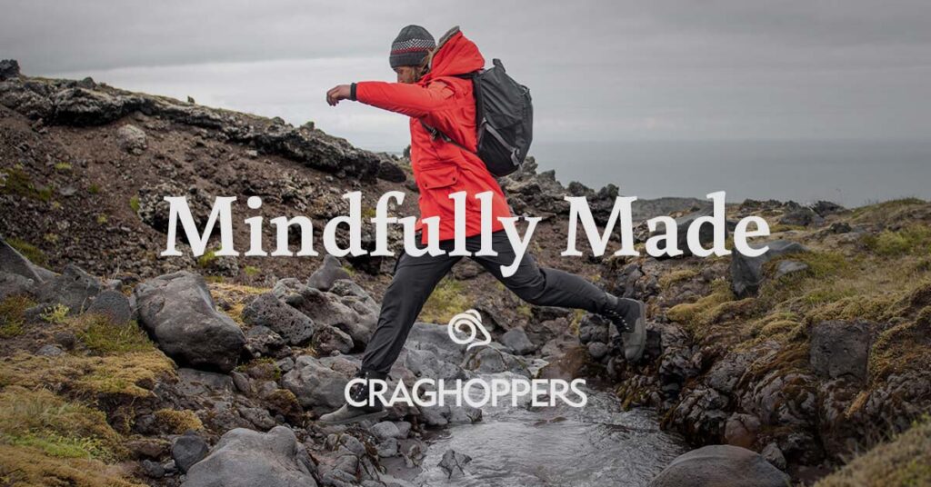
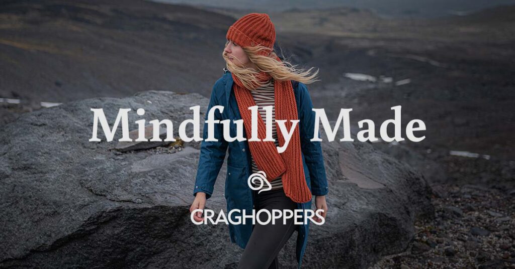
Understanding why Craghoppers is a popular brand in the UK helped set the stage for the best way to move the brand into the U.S. Its rugged gear, sense of adventure, trendy styles, and commitment to sustainability were all key differentiators that appeal to the target audience of outdoorsy, adventurous individuals who appreciate nature, care about the planet, and value rich life experiences.
Adjusting the Brand Messaging, and the Look and Feel, for American Culture
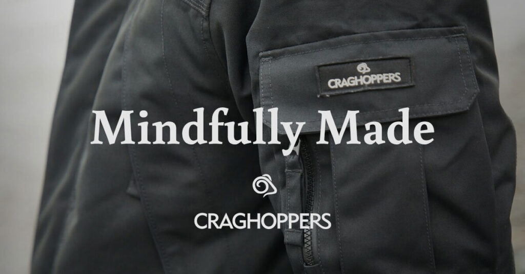
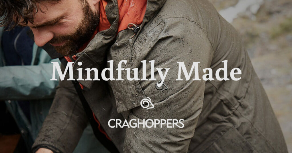
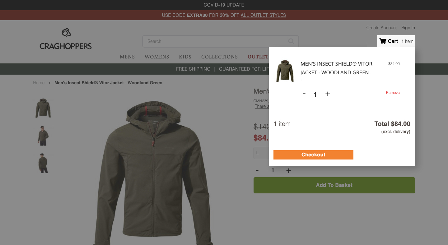
The biggest changes were to the brand’s visuals, which featured the rolling hills of England against its traditionally rainy, hazy backdrop. Swapping outdoor images for ones that better reflected U.S. geographies helped bring the brand into focus in America. Editing the messaging for clarity, which included swapping out terms uncommon in U.S. culture and adjusting traditional UK spellings, also helped Americanize the brand for launch.
Our goal was to honor the British heritage of the brand, recognizing that quality as a draw for many American consumers, while making the brand feel accessible and familiar to someone living in the U.S.
A Targeted Launch
To make a big impact out of the gate, we created an ad campaign aimed at Craghoppers’ target audiences in the U.S. In conjunction with its updated website presence, now fully operational in the U.S., Craghoppers was able to make an immediate impression on American consumers and begin solidifying its presence in the U.S. as a trusted brand with a long British history behind it.
While we were confident we had the reputation to carry success in the American market, we needed help becoming more relevant to the American consumer, and that’s where Fishnet really made the difference.”
Evolving the Focus
To further grow Craghoppers’ presence in the U.S., we have helped the brand make additional improvements to its website, including regular search engine optimization enhancements to content throughout the site.
Supporting Continued Growth
Fishnet remains a partner with Craghoppers to provide support as the company continues to grow its U.S. presence.
It’s always great to work with a brand that you also really believe in and want to use for your personal life. We’re wearing Craghoppers gear, we tell our friends about the brand – it’s a perfect fit for a U.S. audience and we were uniquely positioned to help target that audience and drive Craghoppers’ success here.